Contact Us

Use the form on the right to contact us.

You can edit the text in this area, and change where the contact form on the right submits to, by entering edit mode using the modes on the bottom right. 

6646 Hollywood Boulevard
Hollywood, CA, 90028
United States

(213) 223-6921

Stephanie Gibbs, a bookbinder in Los Angeles, CA, offers edition and fine binding, book conservation, custom boxes, and paper repair for contemporary and historic books, manuscripts, and documents to clients throughout California.

studio news

this year, it's virtual
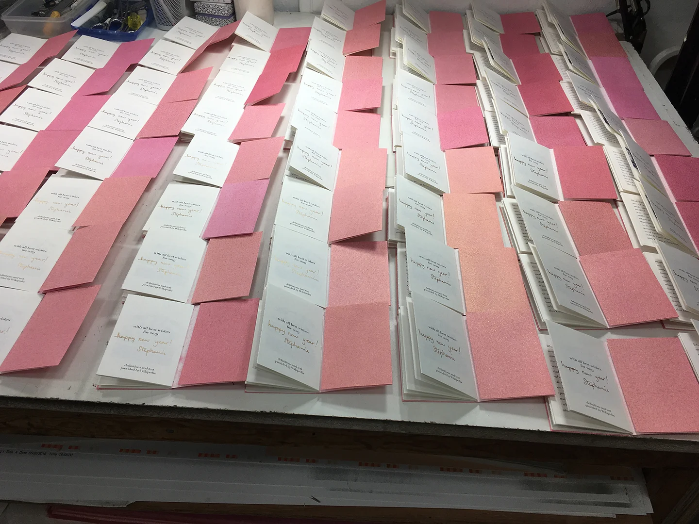
Stephanie Gibbs

While I am the first person to admit that I don't remotely enjoy the performative aspects of art fairs, they are a useful benchmark for keeping track of the passage of time -- in my studio life, days run into days run into days, and I'm never quite sure if a week has passed, or six months, or three years. The Los Angeles Printer's Fair is a particularly sentimental occasion for me (rather than a particularly professional one), since it marks my anniversary of relocating to Los Angeles, and I'm extremely grateful for the landing pad that the International Printing Museum provided upon my arrival. Since fairs aren't happening this year, the LAPF2020 is being held virtually, and I agreed to make a series of short videos as part of their multimedia presentation.

My preferences for technologies are for the outdated and the obsolete; while I'm not a Luddite, I'm also not a technophile. They offered to lend me a professional videographer for the project, but since I closed my studio to the public seven (?!?!?!?) months ago, it didn't seem appropriate to have someone in the space for an extended period of time, while I narrated sans mask. As a result, I cobbled together a narrated series of instructions using my phone and the software on my laptop.

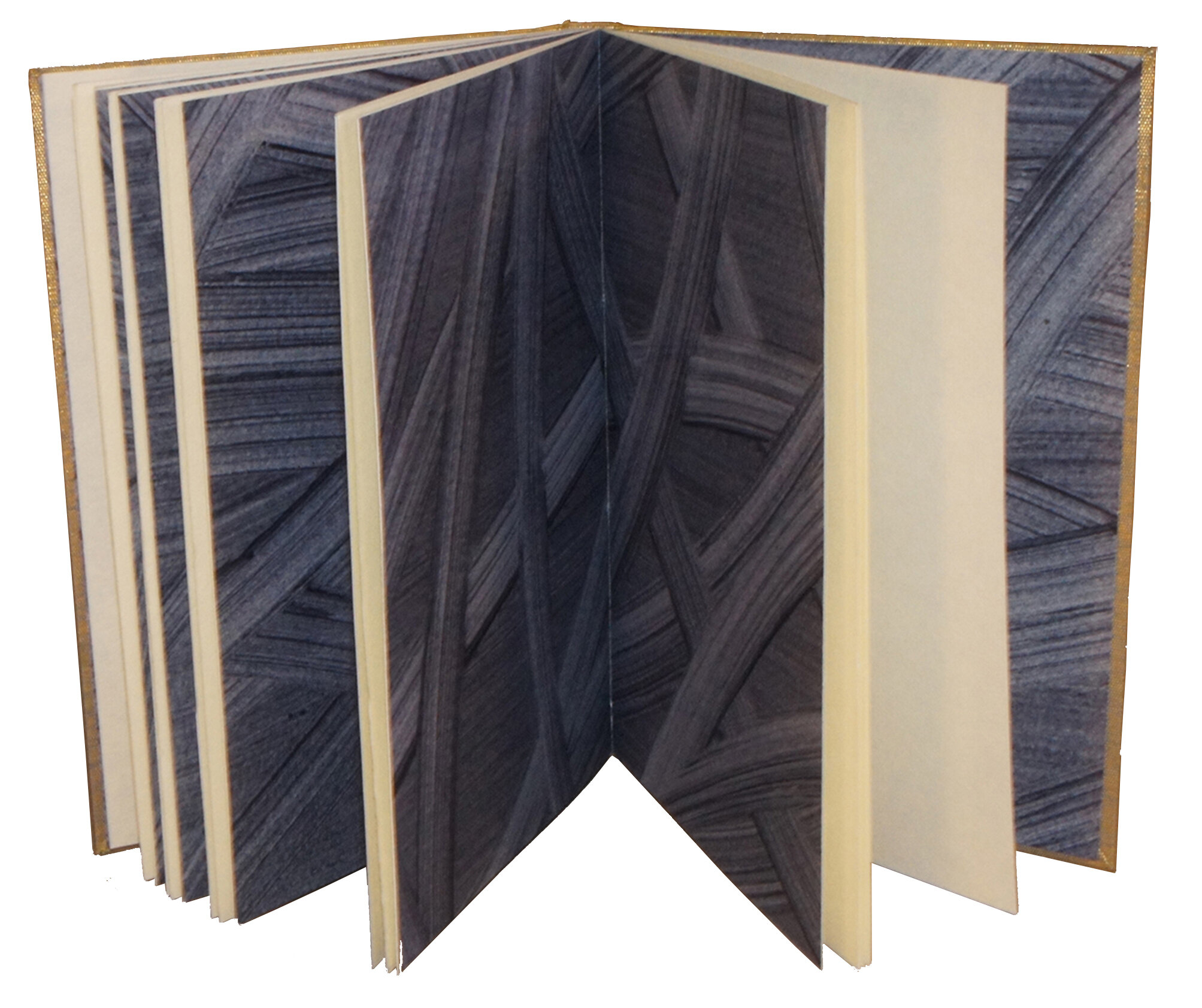
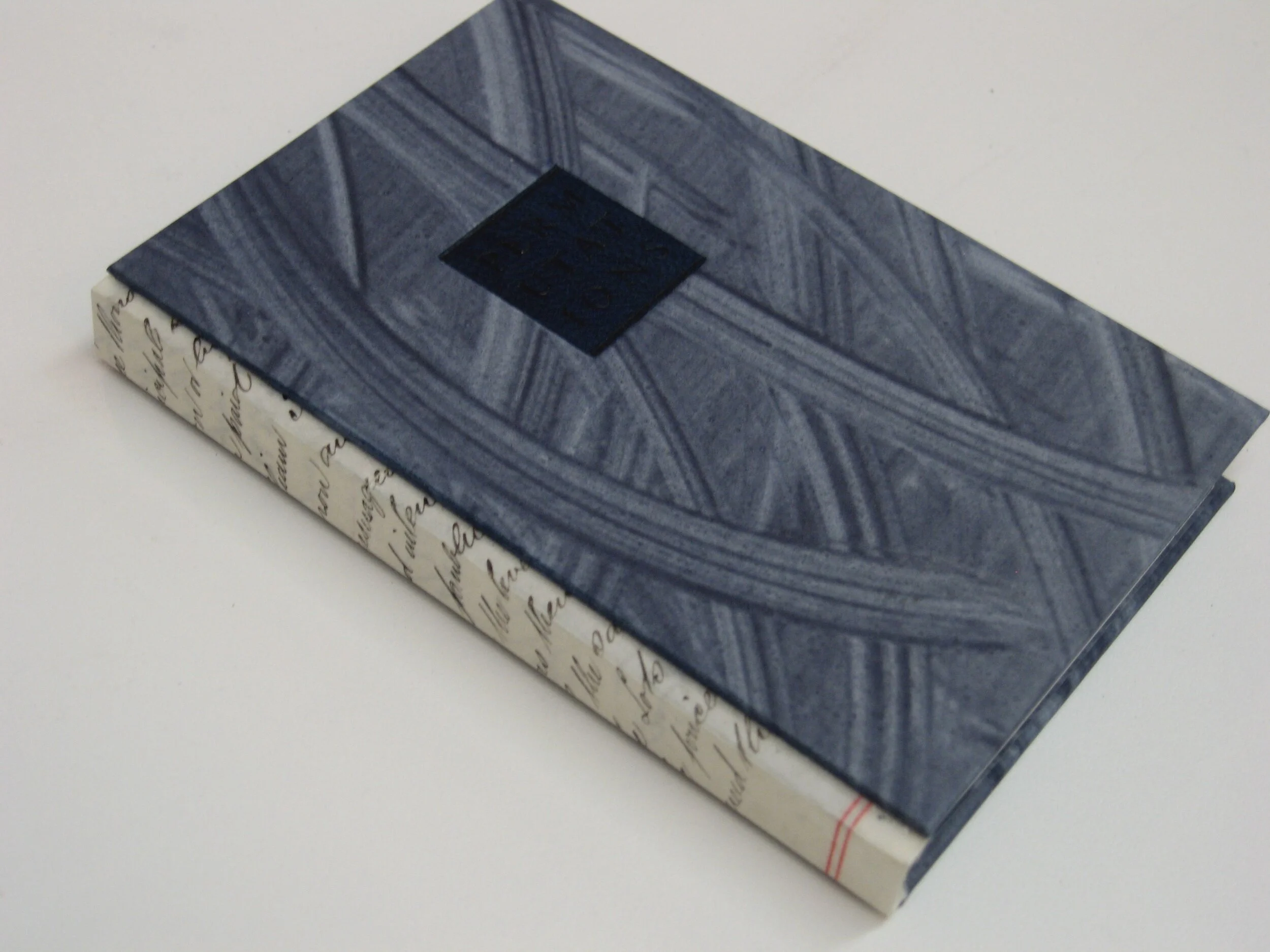
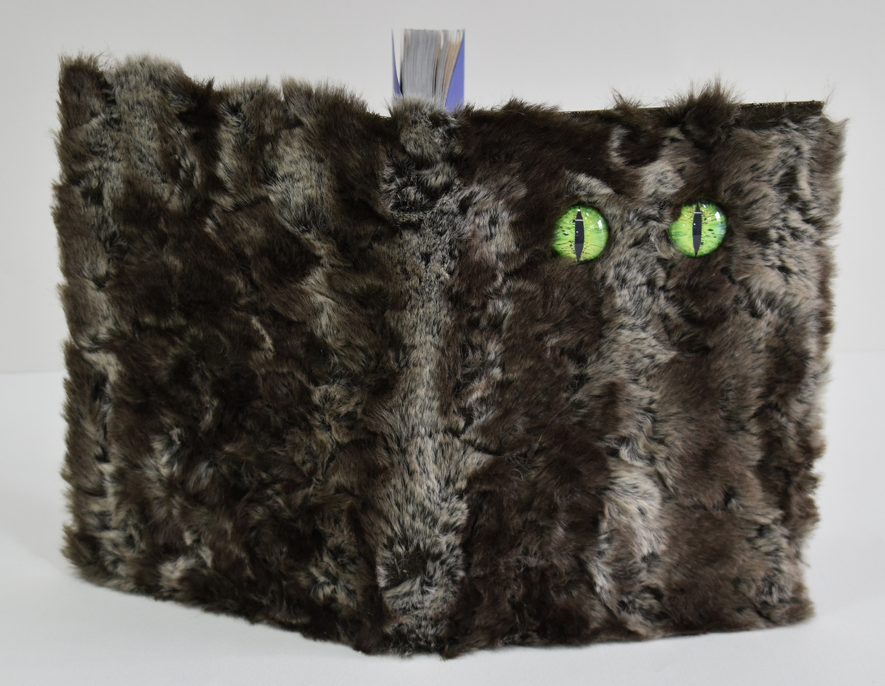
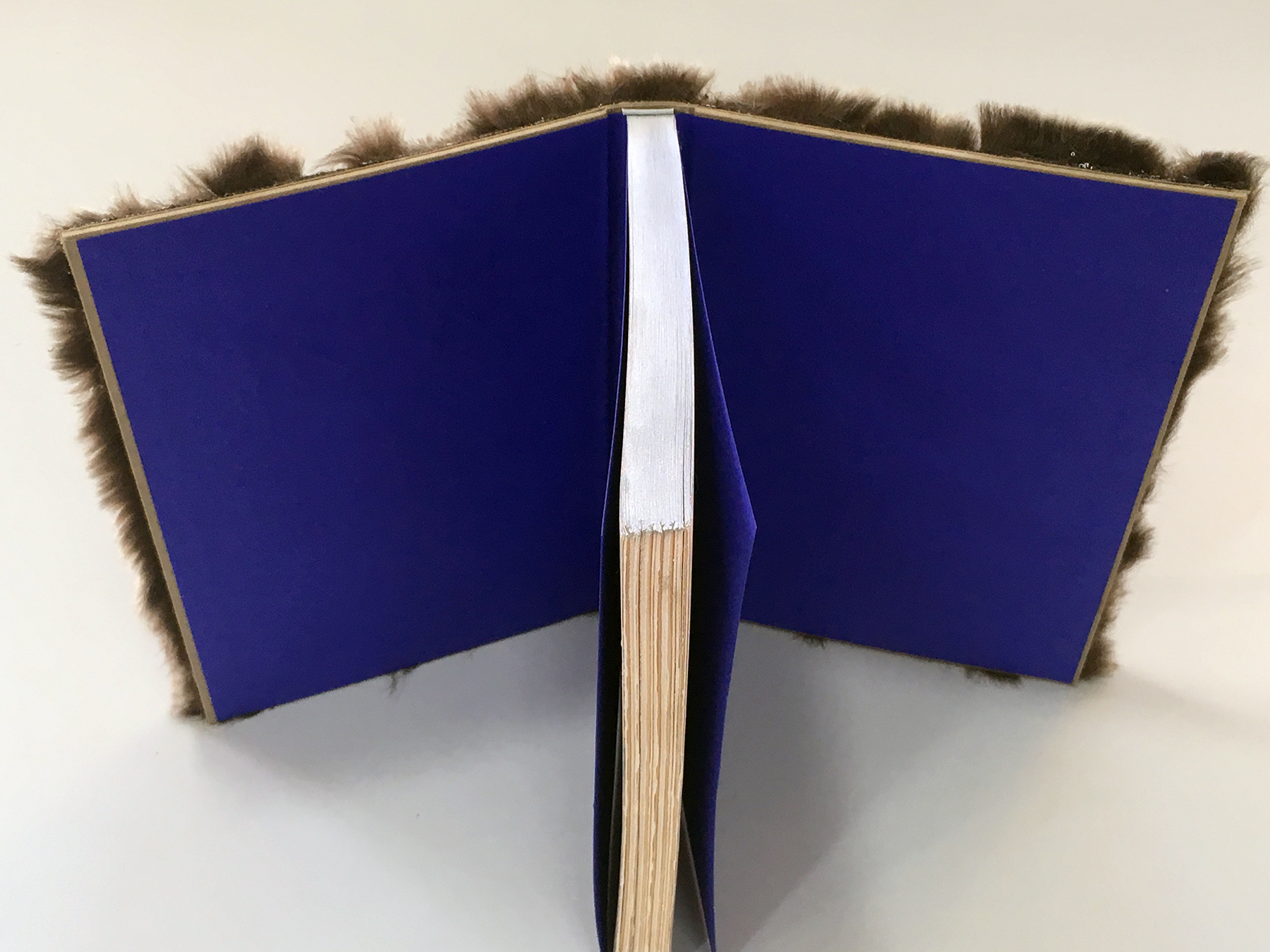
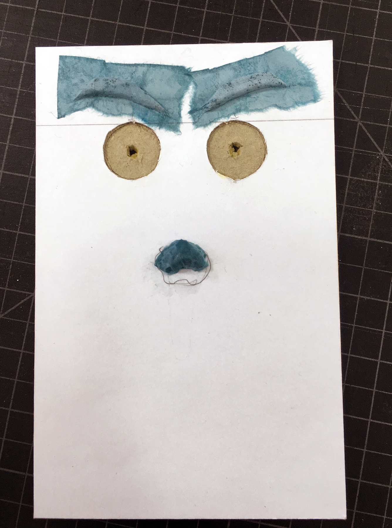
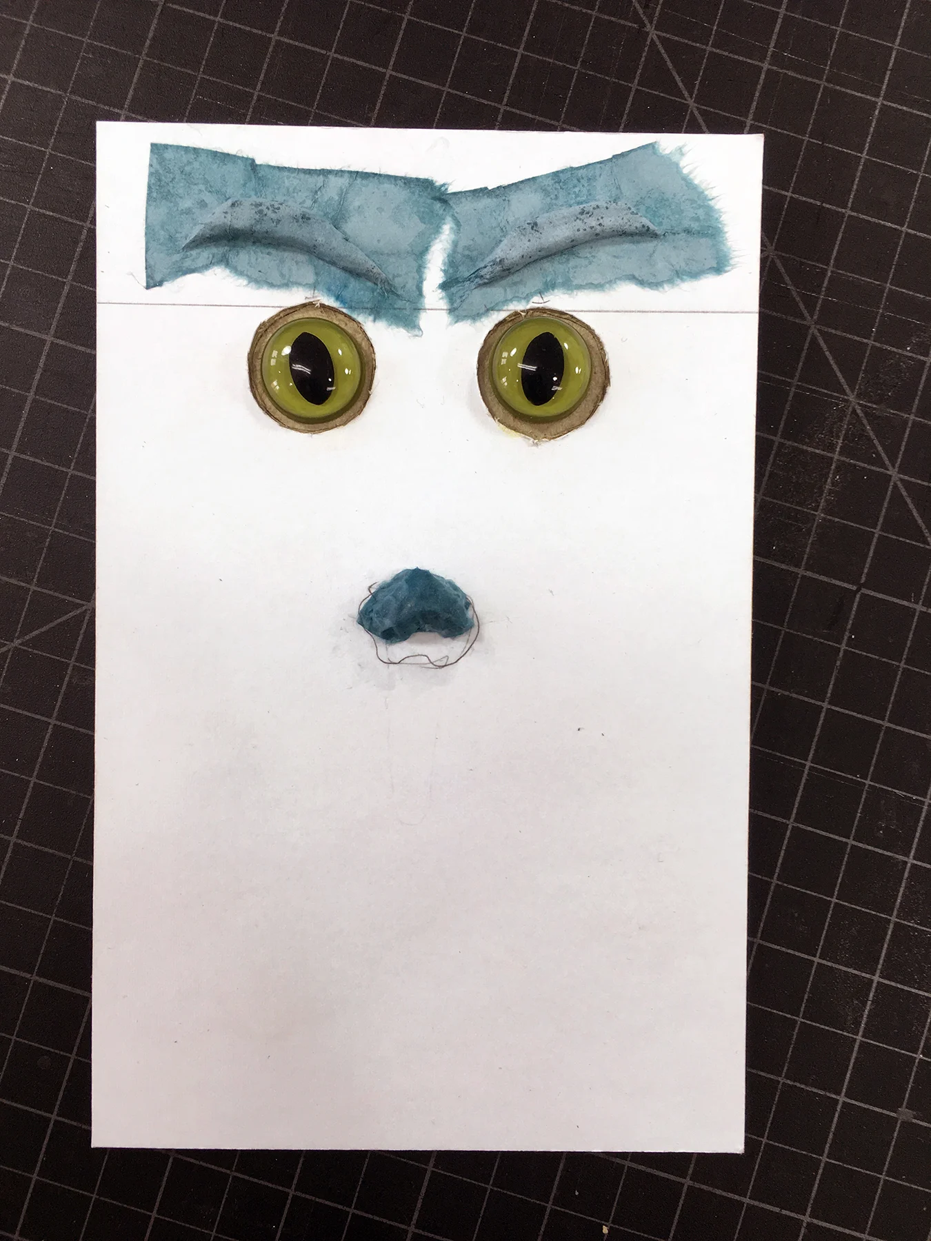
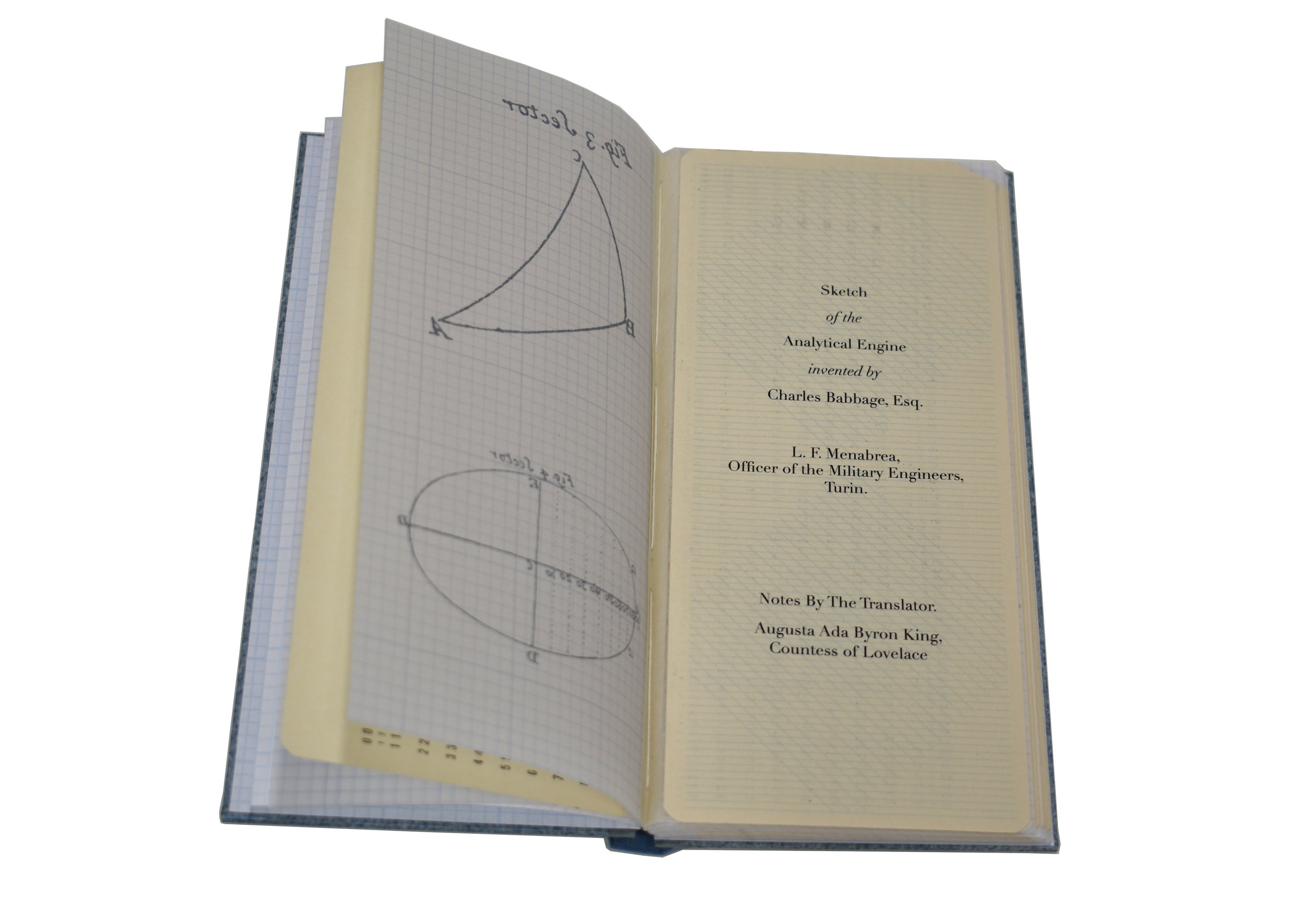
You'll notice that: my hands look exceptionally awful, even by my standards. They're covered in burns from foil stamping, and they're covered in scratches from PandemicKitten™ Vincent. Also, these particular structures are (a) the ones that I generally teach in introductory workshops, and (b) ones I've used in recent Holiday Editions, so I had samples readily available. You'll also notice that I didn't use a pre-written script, and as I was recording the narrations, I was drinking wine. So there's a bit of narrative ... irregularity, repetitiveness, and inaccuracy. At no point do I actually go off the rails, which, to be honest, would have been more interesting. 

 The resulting four videos will appear wherever the LAPF multimedia extravaganza is being posted; presumably on all the usual sites. I don't know if they'll ask me to provide additional content to help fill space. Nature abhors a vacuum, but I would also argue that people abhor amateur multimedia content. These were created with an audience of absolute beginners in mind, and feature such bookbinding materials as Glue Sticks and button thread. 

Rather than drip them out one at a time, I'm posting all of them here, together, since that will make archiving them easier. They can also be found directly on youtube, here.

If you make something as a result of these instructions, please do send me a photo. I love seeing other people's projects!

Introduction


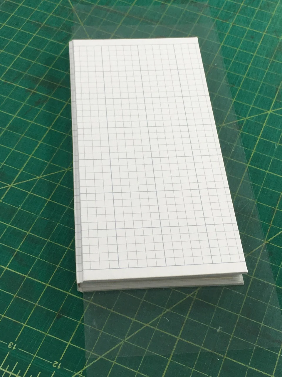
Cut and Fold Booklets


Accordion Books


Sewn Signature Pamphlets


Waterways

Stephanie Gibbs

The Seattle Art Museum recently included my artist's book "Between, Among, Within" in an installation on climate change entitled John Akomfrah: Future History

Notes from the Curator:

The installation, which we have been referring to as "The Vertigo Lounge," takes its name from Akomfrah's three-channel film, Vertigo Sea (2015), that explores the ocean's beauty in our current moment on the verge of climate crisis. In this installation, which is situated in the final gallery of the exhibition, we have included several artist's books that address or reference climate change, a book shelf of climate- and Akomfrah-related titles, a short film about the herring spawn in Sitka, AK, and an interactive element that encourages visitors to record their ideas about ways to save the planet.

The exhibition and installation opened in February, but was closed in March due to the coronavirus pandemic. In lieu of this, the curators of the Akomfrah exhibition are going to do a recorded presentation for SAM at the end of July. That link will be provided as it becomes available. 

The museum requested that I provide additional information about the process of creating this book. The specific questions were:

  • Why did you decide to focus your work on water/water scarcity?

  • Tell us about the process of making Between, Among, Within. How did you decide on the images?

  • What do you want a reader to take away from the work?

  • Since the COVID 19 pandemic, have you thought about this work in a different way?

The following reflections are on the creation, intention, philosophy, and evolution of thinking as pertains to my artist’s book, Between, Among, Within, which was created in 2016 using new research and re-incorporating prior work.

Why did you decide to focus your work on water/water scarcity?

In all of the places that I have lived, I’ve been keenly interested in the interplay between systems for sustaining the delicate balance between human life and environmental balance. Water is a particularly noteworthy barometer for how humans view resources. Water, itself, cannot be created or destroyed. It evaporates; it forms clouds; it rains. It falls into the seas; it falls on land; it absorbs into aquifers. Humans dig wells, then dig deeper wells, then drill into aquifers, then use the water from aquifers without considering the recharging period for water to leech back into the underground system. In Texas, where I grew up, water is a privately owned commodity, like oil or stone. Entire towns in Massachusetts were in protracted legal fights with the Coca-Cola company about losing their water to bottling plants; inevitably, as corporations have deeper financial resources than small towns, the towns run out of money to continue to the fight. Internationally, the problem is even worse.

When I was living in Boston, the city was reconstructing Washington Blvd (which ran through my neighborhood): part of the public works project was replacing the original water pipes of the city, hollowed out logs. After I moved to western Massachusetts, I learned that all of the water consumed in Boston came from flooding several towns in the central part of the state in order to create the Quabbin Reservoir. Entire communities were destroyed, families forcefully relocated, and a public works flooding project engineered in order to provide for “the greater good.” They didn’t even de-construct the towns: when the water level in the reservoir drops, rooftops of the buildings can still be seen, and the original roads have been left as restricted access hiking paths. The politics of the use policies of the Quabbin were equally perplexing. No swimming, no kayaking, but motorboats were fine. Which is going to pollute public drinking water more: a gas powered motorboat or a hand powered canoe? Which has more political power: sportsmen or kayakers?

In 2015, I relocated my home and studio from rural western Massachusetts to central Los Angeles. The first thing that I noticed was how parched the air was: the pervasive dryness was a genuine shock. The state was coming off of a prolonged drought; the reservoirs were emptied or being cover in floating black balls to prevent evaporation; the city was aggressively paying residents to tear out water-hungry lawns and emphasize native, drought-tolerant plants. I felt guilty if it took longer than three minutes to shower. I washed dishes in as little water as possible. When working, I had to completely re-calculate the moisture content of my glue and working time. Projects dried faster, glue dried faster, paper was more brittle, leather reacted differently.

None of this should have been a surprise. I moved to California partly to be in a drier climate. I grew up in Texas, where summer temperatures regularly reach above a hundred, and I have childhood memories of summer droughts in Texas in the 1980s, with watering restrictions and fireworks regulations. I knew that Los Angeles was experiencing an historic drought; I knew that water levels in the Colorado River were so low that the river no longer flowed to the Pacific Ocean; I knew about arid climates and dry seasons. But knowing and experiencing are two entirely different things; I suddenly felt the lack of water, in a way I never had before. The situation in Los Angeles, an arid city reliant on water from the mountains, a city whose boundaries have been shaped with annexed land in order to secure water rights, has been illustrated in the movie “Chinatown,” which, while not a documentary, shows the extreme powers at play in the situation. I watched as the Silver Lake reservoir was emptied; as wealthy homeowners fought to have it re-filled instead of an empty concrete basin (“eyesore”); as a water-bottling company donated thousands of gallons of “expired” bottled water to refill the reservoir. This perverts the water cycle to: rainfall in the mountains; bottling by a private company; donation of water as an aesthetic accessory to wealthy neighborhoods.

And I live in an active earthquake zone. Through all this, I have approximately ten gallons of water squirreled away around my apartment. I check it annually and replace it every two years. I hope I never need to rely upon it. I’m terrified that I will.


Tell us about the process of making Between, Among, Within. How did you decide on the images?

The pastepapers were created in the summer of 2009 for an unrelated and uncompleted artist’s book edition about language and omission. Two editions of the pastepapers were made: indigo pigment in paste on white (machine, western) paper, and indigo pigment in paste on black Japanese paper. Both of these variations are represented in the final Between, Among, Within project. After finishing the prototype, the pastepapers were put into storage and the project languished.

When I began work on the project that became Between, Among, Within, I started by going through my archive of unused project pieces, and separating out those that I thought could be meaningfully re-imagined as new pieces. Looking over the pastepapers, I drew up a list of visual metaphors: flying buttresses, cathedrals, rivers, bridges. Then I began to look for imagery that magnified the interpretations of the patterns. I was thinking quite a lot about waterways, water rights, and rivers; discovering that the entire construction of the system to bring water to the city of New York from upstate had been photo-documented was exciting. I would have preferred to use images that more specifically related to a place that I lived; but I could not find comparable imagery for California, Texas, or Massachusetts.

The photographs were sourced from the New York Public Library historic photography collection, illustrating the construction of the water supply system to transport water from upstate (the Catskill Mountains) to the City in the early years of the twentieth century (1917/1928). What I liked about these photographs was not only the architectural shape of the scaffolding, tunnels, and bridges, but how much they emphasized the human element of the construction. There are men with shovels, men with rail cars, men working. The individual stories of these men have been lost to time: I doubt any statistics were kept as to how many men died working on the project. Presumably state records would indicate whether they were paid laborers or if prison work gangs were also used; what they were paid; how many hours per day and days per week they had to work. This was before the era of the union: and while the resulting structures may be both beautiful and useful, there is rarely an accounting of the human cost of the creation. As a bookbinder, I am deeply attuned to the presence of hand-work towards a completed product; as I consider the history of the industrial revolution and the changing attitudes towards “labor” and “work”, I look for the visible residue of human hands on construction projects of a massive scale.

The inclusion of a map showing the natural path of the waterway was equally integral to the project. Water flows from high elevations to lower elevations; water flows from the mountains to the sea. However, it does so in a pattern that, quite literally, meanders, creating oxbows, eddies, and rapids. The end result of the path may be the same, but the entire ecosystem and shape created by the will of the water is distinctly different. Nature has a path, and it is not the road of man.

The sine curve chosen for the cover stamping, in lieu of lettering the title, provides a geometrical metaphor for rising, falling, and cycling; not the movement of wave theory, but the back and forth as an equilibrium is sought.


What do you want a reader to take away from the work?

I do not have any particular expectations for the reader of the work. Some will find meaning in the shape of the pastepaper patterns; others will be fascinated by the photographs. Many readers miss the map component altogether. I would like the pastepapers to function as the connecting waterway through the construction of the systems, flowing the reader downstream, and providing pauses between the images for the mind to reset before it take on new information. I’d like the readers to think about pathways and to think about intentions, and to think about the layers of costs, human and environmental, of shaping nature and of supporting human life.


Since the COVID 19 pandemic, have you thought about this work in a different way?

Since the COVID-19 pandemic, and the racial justice protests that have accompanied it, I’ve been thinking about the distinctly American philosophies that underpin the way we treat our environment, the way we treat our fellow humans, and the role that we allow the government to play in enacting these beliefs. The complete re-routing of a watershed system across a state, an “inconvenience” to a few and a rebuilding of nature, was deemed essential by urban planners in the early twentieth century. There was no small amount of loss associated with destroying entire communities and changing the flow of rivers, but the need to support human life on a larger scale was deemed of higher importance. The system pictured in these photographs predates the 1918 flu,and the expansion of the system predates the 1930s depression; this serves as an indicator for what governments can accomplish when the will power exists. This was all done on a state level, with federal funds and support.

What I see now is a system where there is no political will to take care of the lifeblood of a population. There are National Guardsmen with machine guns posted underneath the windows of my studio. Last week the intersection under my windows was full of tactical police in riot gear rerouting peaceful protestors using aggressive means. I moved all of my clients’ work out of my studio and to my apartment because I’m terrified of arson. I’m also terrified of tear gas.

Now imagine a different outcome. Look at the political will that created lakes, that rerouted rivers, to provide water to cities across America. Imagine if instead of insufficient $1200 one-time allowances from the government, people were given an amount of money that actually covered the cost of rent. Imagine if instead of publicly traded companies scooping government loans, that money actually went to the many small businesses and independent contractors who have had difficulties getting their applications approved. Imagine if instead of billionaires and congressmen selling off stocks at the start of the pandemic that grocery store, warehouse, and slaughterhouse workers were paid not a minimum wage but a living wage. Imagine if in the middle of a major medical pandemic people’s health insurance wasn’t tied to their employer, as businesses are laying off employees and closing. Imagine if instead of police officers being funded to purchase military gear that medical workers had all the PPE they required to not die while saving lives.

We live in a country with great resources and great willpower. We have the ability to envision a different outcome, to plan the pathway to achieve that goal, and to put forth the effort for the vision to become a reality. Imagine if physical health, economic security, and racial justice was given the same importance as water.

A Christmas In Scarlet

Stephanie Gibbs

2019 was a year of whiplash: fantastic opportunities, and the corresponding riptides of life. Earlier this autumn, while listening to Decoder Ring, the following passage from a Sherlock Holmes novel struck home:

“My dear fellow,” said Sherlock Holmes as we sat on either side of the fire in his lodgings at Baker Street, “life is infinitely stranger than anything which the mind of man could invent. We would not dare to conceive the things which are really mere commonplaces of existence. If we could fly out of that window hand in hand, hover over this great city, gently remove the roofs, and peep in at the queer things which are going on, the strange coincidences, the plannings, the cross-purposes, the wonderful chains of events, working through generations, and leading to the most outré results, it would make all fiction with its conventionalities and foreseen conclusions most stale and unprofitable.”


The book is Arthur Conan Doyle's A Case of Identity; while listening to You're Dead to Me, I discovered that Sherlock Holmes was a part of the Victorian publishing Christmas rush. In fact, further research revealed that “Beeton’s Christmas Annual” published the first Sherlock Holmes story, A Study in Scarlet.

I had a collection of USGS Survey Maps of Southern California that had been CalArts library discards, and, after several years, they were finally flattened from their rolled storage state. I wanted to print the text as an accordion book on one side, and have the reader flying over the skyline on the other side, like Peter Pan and the children fly over the skies of London.

The skyline that I found is from St Nicholas Magazine in 1907, although the city itself isn't specified, so it can be whichever city the recipient wants it to be.

However, after putting together layouts in InDesign for an accordion book printed in two sections, 2-up on a 12"x18" layout, I discovered that I didn't have sufficient stock of USGS maps to use for the edition. So I called the LAPL map room, and they very kindly let me take freely from the discard pile. I took a very generous amount -- which ended up being the right decision, because the printer printed the first batch with the front page right side up, and the reverse upside down. There were plenty more maps to cut down; this is good, since there were also a fair number of registration issues: the machines didn't like the stock that the maps were produced on.

I knew that I wanted the covers to pick up on the colors of the USGS maps, and Hiromi Paper has a metallic range that is exactly the color of the landscape markings. And I wanted to bring a sense of the fantastic to the text, through a pastepaper pattern.

The acrylics were supposed to be burnt orange, to go with the warm copper tones of the covers and maps, but, due to the actual pigment color of the paint and the vast quantity of iridescent medium that I added, the color could more accurately be called "the blood of fairies."

The pastepaper pattern was pulled as a relief print: the maps were doused in a water bath, the pigment spread over a mirror, the maps placed over the pigment, then rubbed with a paint roller.

There was absolutely no consistency of pigment from print to print; some were gentle washes, and some were much more strongly colored. If this had been any other type of edition, I would have overpainted the gentle washes so that all the books were the same, but these are holiday cards, and the differences are part of their charm.

The edition of papers took up my studio floor and the hallway -- but this is, of course, what hallways are for. After drying and flattening the maps (and USGS maps are on great paper -- they took the water, painting, and drying process without a hitch, which was a relief after they were so difficult to print on), I decided to go ahead and fold them as an edition, even though the registration issues meant that each floated a bit on the page. As a result, the margins aren't perfect, but they are in close enough tolerances to work as an accordion book. The parent sheets were then cut down after folding.

Then the two parts of the accordion were glued together, with the overlap on the face of the page, rather than as an interruption of the skyline.

"The differences are part of the charm" is the same refrain that I repeated when I realized that my cover structure, where the turn-in forms the pastedown, would require more paper than I had actually purchased, so I ended up incorporating some silver paper from the same line that I had in the studio as the covers for some of the books.

The cover art is symbolism from a topography chart, that mirrors the design of a map compass: pointing you in a direction, despite the winds swirling in all directions.

Each recipient receives a slightly different landscape, and slightly differently colored paper -- as we each have our own path that we're following.

As a result of the number of pages in each book, they can be displayed as stars, not merely as a traditional accordion, a happy accident.

Wishing you a happy new year, and a safe and interesting journey!

experiments in fur and molded leather

Stephanie Gibbs

In ongoing research and development news, the studio has been experimenting with a range of new materials for custom bookbinding. The most recent materials that are being worked with are real and artificial furs; and molded leather.

Artificial fur needs to be backed, and then treated like bookcloth.
Real fur requires additional stretching, consolidating, and shaping, but can then be mostly treated like leather. Skins from several different tanneries have been tested.

Both model bindings have inset eyes; the real fur binding uses garment and fur-working textile techniques to incorporate a leather nose, suede-lined fur ears, and a sewn tail. The artificial fur binding has silver color on the outside of textblock.

In the test bindings, an underlayer of a paper-case cover has then subsequently been covered with real or artificial fur, which has been trimmed along the edges. Owing to the woven nature of the artificial fur, and the growth direction of the natural fur, experiments with turn-ins and edge finishing will be undertaken to examine possibilities for finished edges. Several experiments have resulted in a surface treatment that allows both types of material to take foil stamping.

For the molded leather test, papier mâché has been formed using Japanese paper and wheat starch paste, working over a core of hemp cord. The eye recesses have been established, and the leather worked over the shapes and allowed to dry. Further experiments with using tooling to create texture are next…

white leather now available

Stephanie Gibbs

Several clients have requested work in white leather, which is not a material that the studio has historically been able to source.

This is due to the fact that the leather used in bookbinding is calfskin or goatskin, both processed with vegetable tanning, which results in a tan, tea-stained appearance in the natural state. The resulting leather cannot be successfully overdyed white.

For the purposes of props, photography shoots, commercials, and the like, a source for white leather is now available:

Top image: white lambskin, garment quality, slight buttery undertones. Smooth surface. Thinner leather. Sourced in Los Angeles.

Lower image: white buckskin, craft quality, slight blue undertone. Grained surface. Thicker leather. Tannery in Maine.

For any project of an archival nature, white vellum or alum tawed pigskin remain the leather options for a white binding, if cloth or paper are not appropriate materials.

Enumerations.

Stephanie Gibbs

In 2015, a road trip resulted in an artist's book ... and a relocation across the country.

The artist's book, The Meter Was Out Of Order, formed the structural underpinning for a 2019 artist's book, Enumerations.

Edition size, 16, of which 8 are deluxe copies.

I have an established interest in creating standard book structures out of nonstandard pages, and I'm fascinated with different language systems and different number systems. As an undergraduate student, given the opportunity to choose between math and computer science coursework, I chose computer science -- after all, programming is just another language, and syntax and vocabulary are skills that I, as an English major, understood quite well.

Over the past few years, the history of women in computer science and mathematics has been explored across a range of resources in popular culture, from the "computers" in "Hidden Figures" to the explorations of Ada Lovelace and Charles Babbage in a graphic novel by Sydney Padua, to the inventions of Hedy Lamarr, an actress who decamped to technology.

One of my favorite podcasts is "In Our Time," a BBC program wherein academics discuss the history of ideas. Their math presentations are particularly engaging, and, when this project was germinating, three programs in particular were of special interest: Maths in the Early Islamic World | Pauli's Exclusion Principle | Carl Friedrich Gauss .

What we have from all of the above is a fascination with math, language, and numbers, as developed through history and explored in the fields of philosophy and culture. This project developed over the course of a year, as I examined different aspects of combining ideas of memory, craft, and technology into one book project.

I knew that I wanted to print the book on computer punch cards; my father found a batch of unpunched cards from Los Alamos via ebay, and then I purchased an additional batch of punched cards from a programmer's personal archive via Craigslist -- he had punched all the cards for graduate school projects, and held onto them for all these years.

For the text, the obvious choice was the writings of Ada Lovelace. Anyone who is taught mathematics as a child in order to prevent the dangers of becoming a poet is someone worth paying attention to; that her poetic lineage was the very well-known Lord Byron was especially fun. Originally, I wanted to print all of her equations -- she is credited with writing the first computer algorithm -- but then ran against a basic problem: my own math skills, and my own programming skills, couldn't follow her writings. So I focused on what I could understand, the Note that was specifically about the functioning of the Analytical Engine being based on Jacquard looms.

In this note she specifically references a contemporary article about how Jacquard looms operate, and I was able to locate the text of this article, which had phenomenal drawn images illustrating the parts of the loom. The text of the book was coming together: the interwoven story of the loom and the computer.

From my reading about math history, I knew that the use of the slide rule was a means of making trigonometry tables portable during any calculation, rather than having to reference printed guides; and that the early computers were designed to calculate trigonometry in order to successfully land the Apollo space craft on the moon. Therefore, additional components of Enumerations: the trigonometry drawings, the slide rule, and the cope rope memory, were also included as ways of providing mathematical memory and making it accessible.

Early on, I knew that I wanted a slide rule to be a component of the book project; and it was at a dinner party where framed card slide rules were displayed on a wall that I realized this format existed. The hostess very kindly gave me an extra card from her collection, which formed the pattern for this project. The online resources at the Oughtred Society were also invaluable, as was the collection at the Smithsonian Institution. Conversations with my clients (who often collect scientific and mathematical paraphernalia) were also incredibly helpful.

From another In Our Time episode, a passing reference was made to Raytheon and cope rope memory: subsequent research provided the story that this form of memory, which enacts binary code into a hand-woven magentic wire structure, was constructed by textile workers in Massachusetts, as they had the necessary hand skills to create accurate handwoven hard drives.

And then, at the end of the project, I learned that my father had been using core rope memory during his time working in encryption in the Navy. He wanted me to make actual core memory wiring structures: but this is a book about craft and technology in conversation, and so I created embroidery samplers instead.

As a slide rule is a primitive calculator (external memory) and the punch cards are early forms of rendering computer programs, the deluxe edition of the book also includes still-written computer diskettes from the family archive. When I was researching different types of number representations, my brother (a programmer) reminded me that hexadecimal is how colors are represented in web page displays -- and therefore a booklet comparing base 10, binary, hexadecimal, colors, and Roman numerals was included as a small numerical dictionary.

the oracle: holiday edition 2018/2019!

Stephanie Gibbs

IMG_E9075.jpg

The 2018 / 2019 holiday edition was actually mailed out close to a month ago, but things in the studio have been very busy what with Codex 2019 and those affiliated projects (to be updated separately), and so the holiday edition report is slightly delayed.

Happy new year!

January is a month I feel deeply ambivalent about. I absolutely love the metaphor of fresh starts and reconsideration; the opportunity to think deeply and recalibrate. I also deeply hate being cold, or being wet, and definitely am a pathetic beast when I am both cold and wet. I'm a fire element, and it shows. Even in Los Angeles, the weather in January is cold and wet (or "cold" and "wet" if you haven't any sympathy for highs in the sixties and an inch of rain), and so I look outside, and take more cough medicine, and sigh, and think about the meaninglessness of existence.

Which leads to this year's holiday edition, which is an alphabet booklet of forms of divination. When the future seems full of unpredictable randomness, when whether the outcome is a win, lose, or draw doesn't seem related to the efforts put forth, when past performance is absolutely no indicator of future outcomes, where do you turn? The truth is that I consider myself a happy person, that I'm thrilled with the life I've created, that I'm thriving in this surreal landscape of southern California, but also that my life is weirder and less predictable than any horoscope could advise. I love this randomness, but also hate not being in absolute control of my own fate.

Into which vacuum steps divination. While I, personally, don't really believe in anything, that also means that I am tempted to believe in absolutely everything. Why not, if all of life is a metaphor? And the beauty of wikipedia provides all the methods of divination a person could ever require.

The covers for the booklets were the leftovers from the Parenthesis pastepaper project of summer 2018; the text various methods of divining the future as researched on wikipedia; the images from collected imagery from various art projects that I've either thought about doing or actually done.

The format of the booklets is one that has been used in previous ephemera projects, such as the 2013 holiday almanack, a sewn two-signature pamphlet binding with wraparound covers. The internal design is so that each signature is a letter-sized sheet of paper, printed double sided, that is folded, cut, folded, sewn all together, and then cut.

As always, your results from your divination pursuits should be handled with care, but go forth and find your future.